
At a glance.
The product team flagged low early retention: a significant number of players were dropping off within the first few minutes. That data gave the company a clear signal that a revamp was needed. The home screen and character customization were the first two things every player saw, and neither had been meaningfully updated in 8 years while the catalogue grew significantly. I joined the revamp to audit the existing screens, identify where the experience was breaking down, and redesign the opening flow with a visual language that matched what the game had become.
Problem
Low early retention: players were dropping off within the first few minutes of hitting the opening screens.
Solution
A unified, gold-led visual language and clearer navigation across the home and customization screens.
My role
Brainstorming, testing, and visual design for the home and customization screens; 2D asset production.
Outcome
Shipped redesigns of both screens, with a cohesive icon set and elevated typography aligned to the brand.
My role at EA.
Outside of my 2D design work at EA, I contributed to a broader UI/UX revamp the team was undertaking. The game had evolved significantly in the 8 years since launch, with a much larger catalogue of items, clothing, and features that the original UI was never designed to support.
My involvement spanned the brainstorming, testing, and design phases, with a focus on reworking the starting screen and character customization screen. I was also working on redesigning the tutorial scene, though that part of the project was cancelled before it shipped.
Players were leaving early.
Data showed low retention rates: a significant number of players were quitting or deleting the game after only the first few screens. The core goal of the revamp was to address this and bring those numbers up.
The early drop-off pointed to the first impression as the key problem. The starting screen and character customization were the first things every player touched, and if those screens weren't drawing people in, no amount of content deeper in the game would matter.
Auditing what wasn't working.
To understand where the existing screens were failing, the team annotated the UI directly with observations. It was a quick, low-fidelity way to surface friction points and build a shared vocabulary around the problems before any redesign work began.
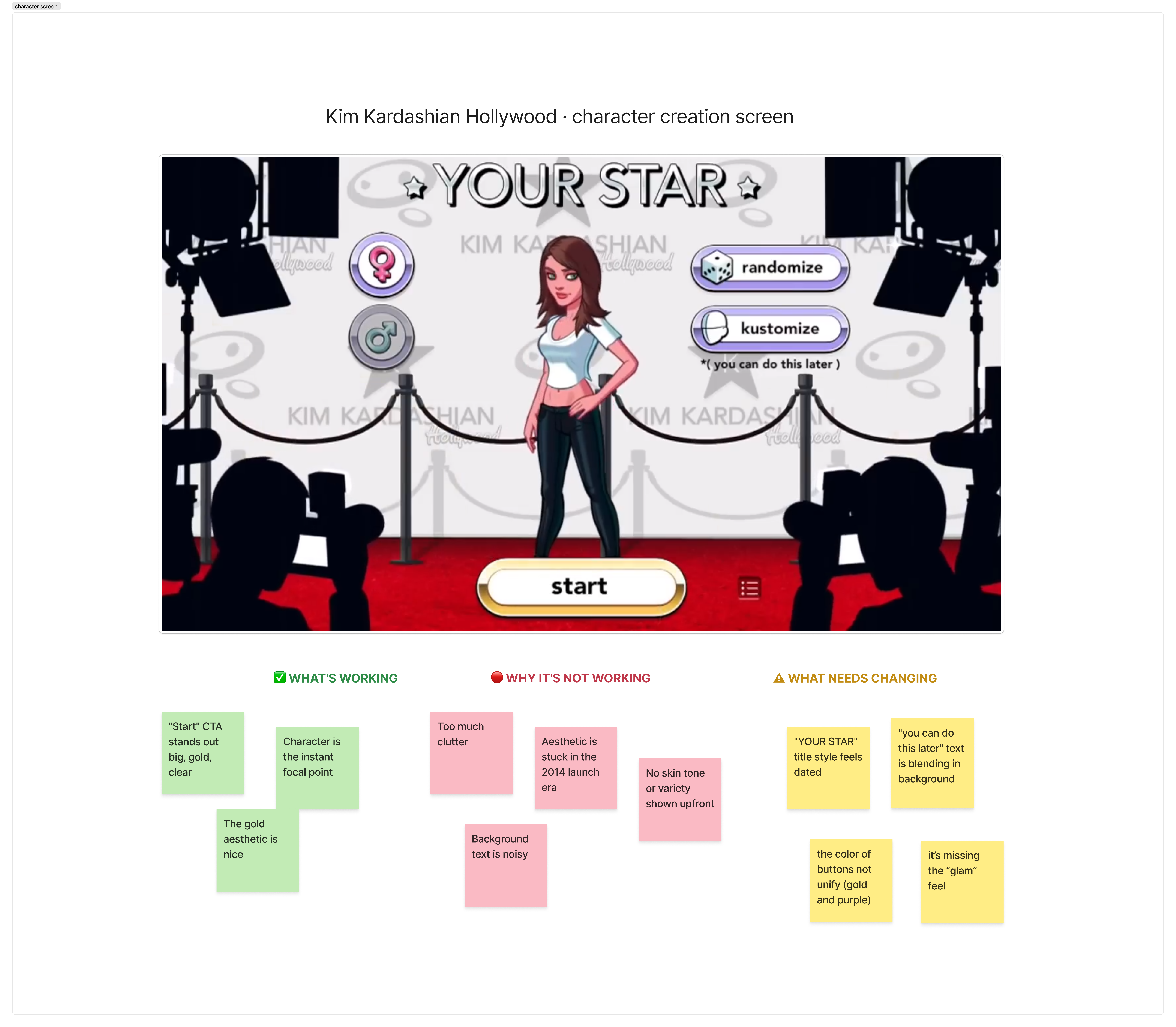
Branding needed a refresh
The game's identity is built around luxury, glamour, and high fashion, but the starting screen wasn't communicating any of that. As the player's very first impression, it needed to do a much better job of reflecting the brand.
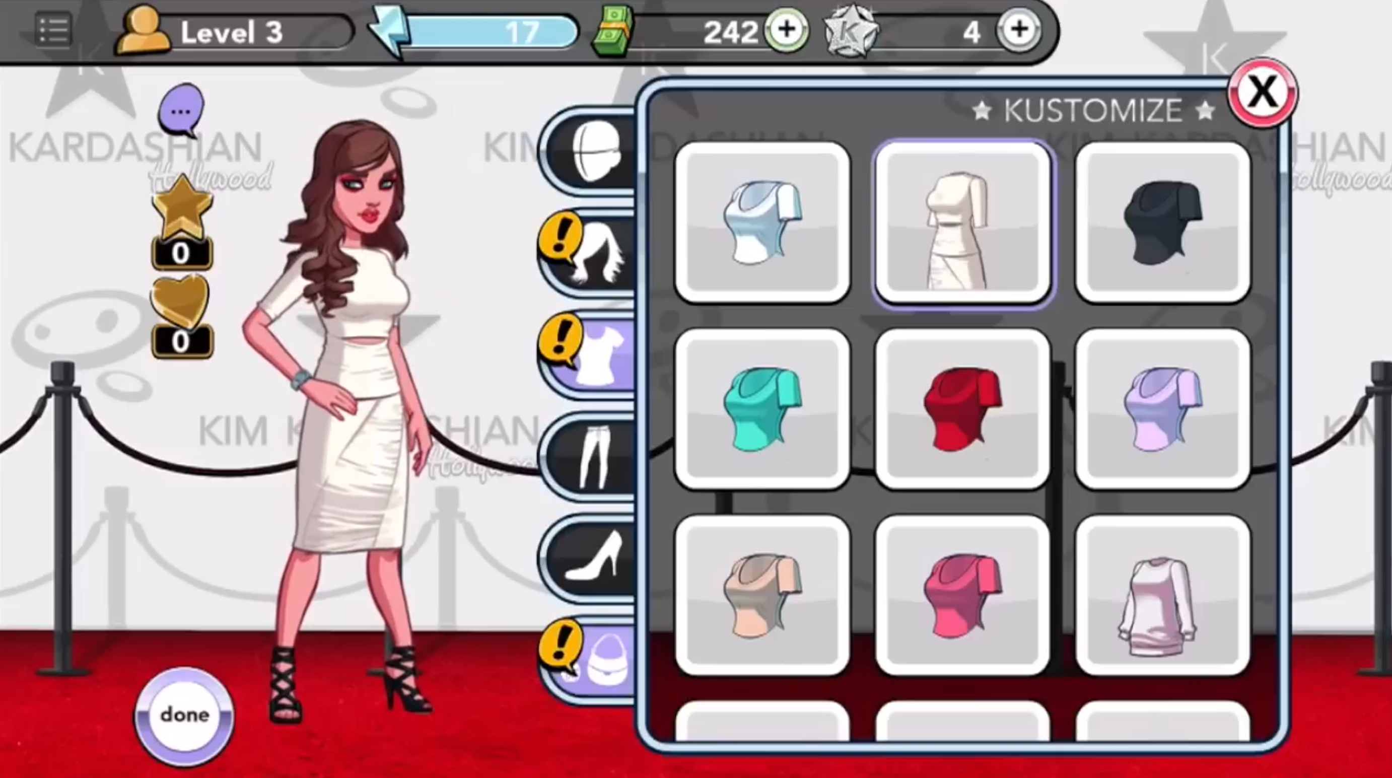
Visual noise and clutter
The background environment competed with the UI rather than supporting it. Text and visual elements fought for attention, making it harder for players to focus on the actions they needed to take.
Outdated visual style
The original design hadn't been meaningfully revisited since launch. Nearly a decade later, the typography, color, and layout felt out of step with where the game and its player base had grown.
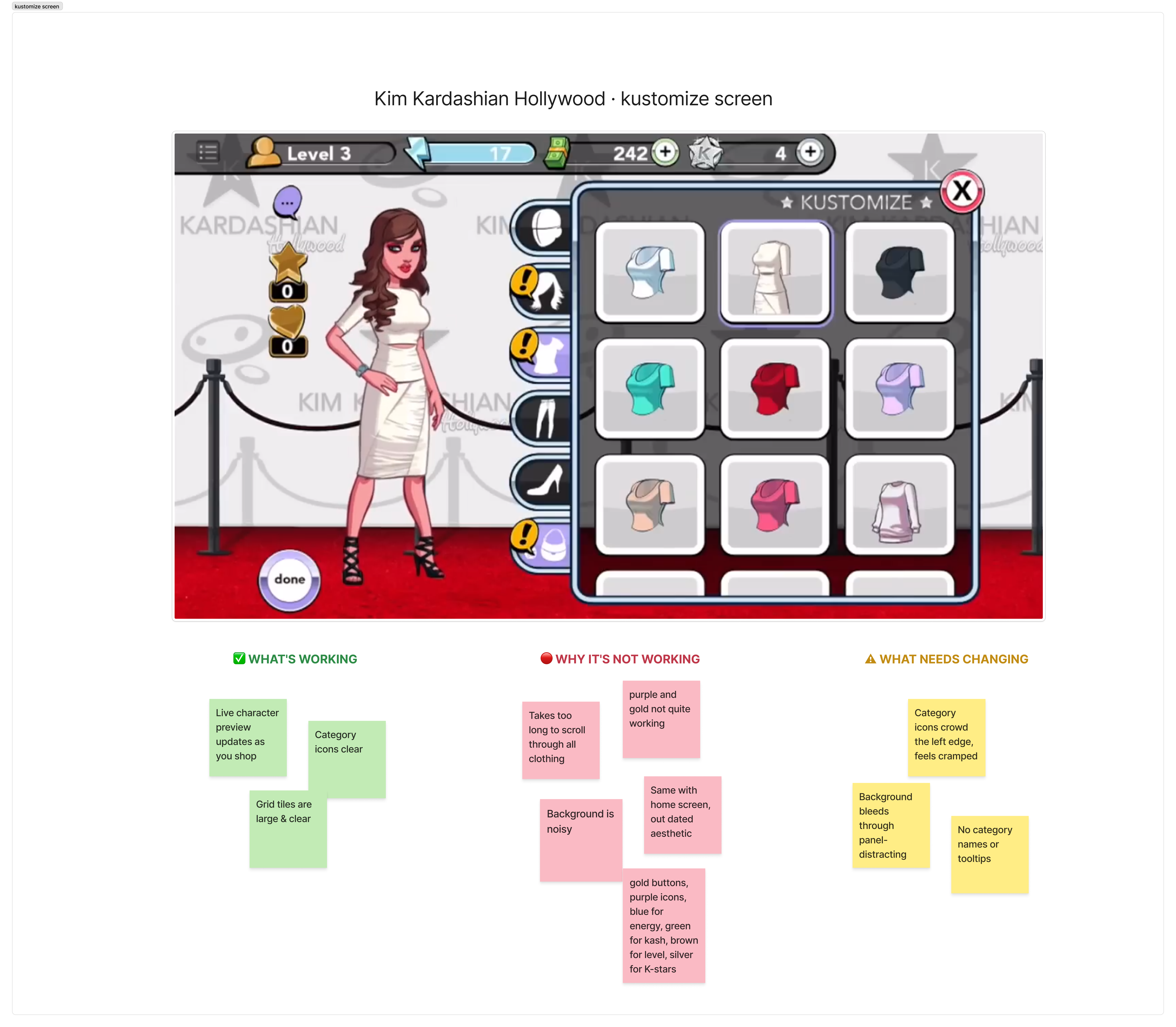
Content had outgrown the structure
The customization screen was built for a much smaller inventory. Years of new items made browsing increasingly hard, and the layout couldn't accommodate the volume without feeling cluttered.
UI lacked visual cohesion
Category icons were white, button borders purple, stars gold, energy blue, cash green. With no unifying visual language, the result felt scattered rather than intentional.
Navigation relied too heavily on icons
Many newer items no longer fit neatly under a single icon, but there were no category names or tooltips to support them. Players had no clear way to tell where something would be found.
Anchoring the redesign in gold.
One element from the original design had unanimous support from the team: the golden "Start" button. Rather than designing from scratch, we used that as the anchor. From there, we built an entire visual language around it, establishing gold and metallic sheen as the foundation of a system that finally matched the luxury and glamour the brand had always promised.
Every design decision was held to the same bar: modernize the look and feel without disorienting the players who already knew the game. Refresh the surface, respect the muscle memory.
Home screen redesign.
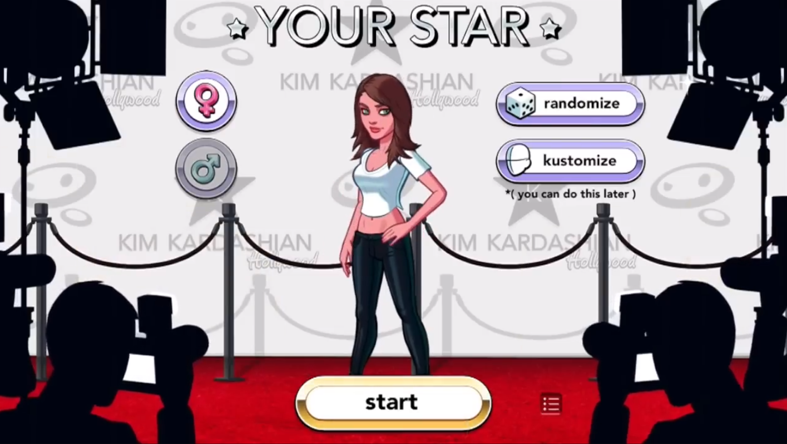
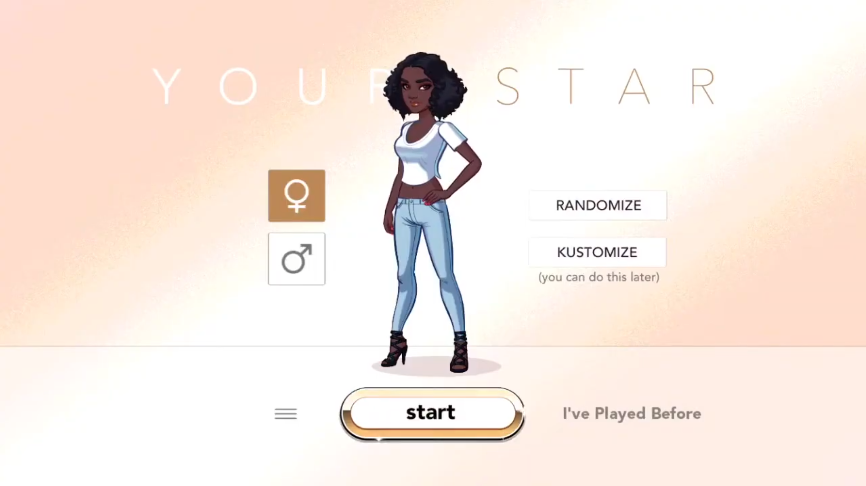
Gold as the design foundation
The original golden "Start" button became the anchor for an entire metallic visual language, giving the brand the luxury and glamour it had always stood for but never fully expressed.
A cleaner, more focused screen
The cluttered background was replaced with a clean, minimal backdrop that lets the character and UI take center stage, with no more competing for attention.
Typography that feels like the brand
Outdated typefaces were swapped for fonts drawn from high-end luxury and couture references, instantly signaling the kind of world players are stepping into.
Customization screen redesign.
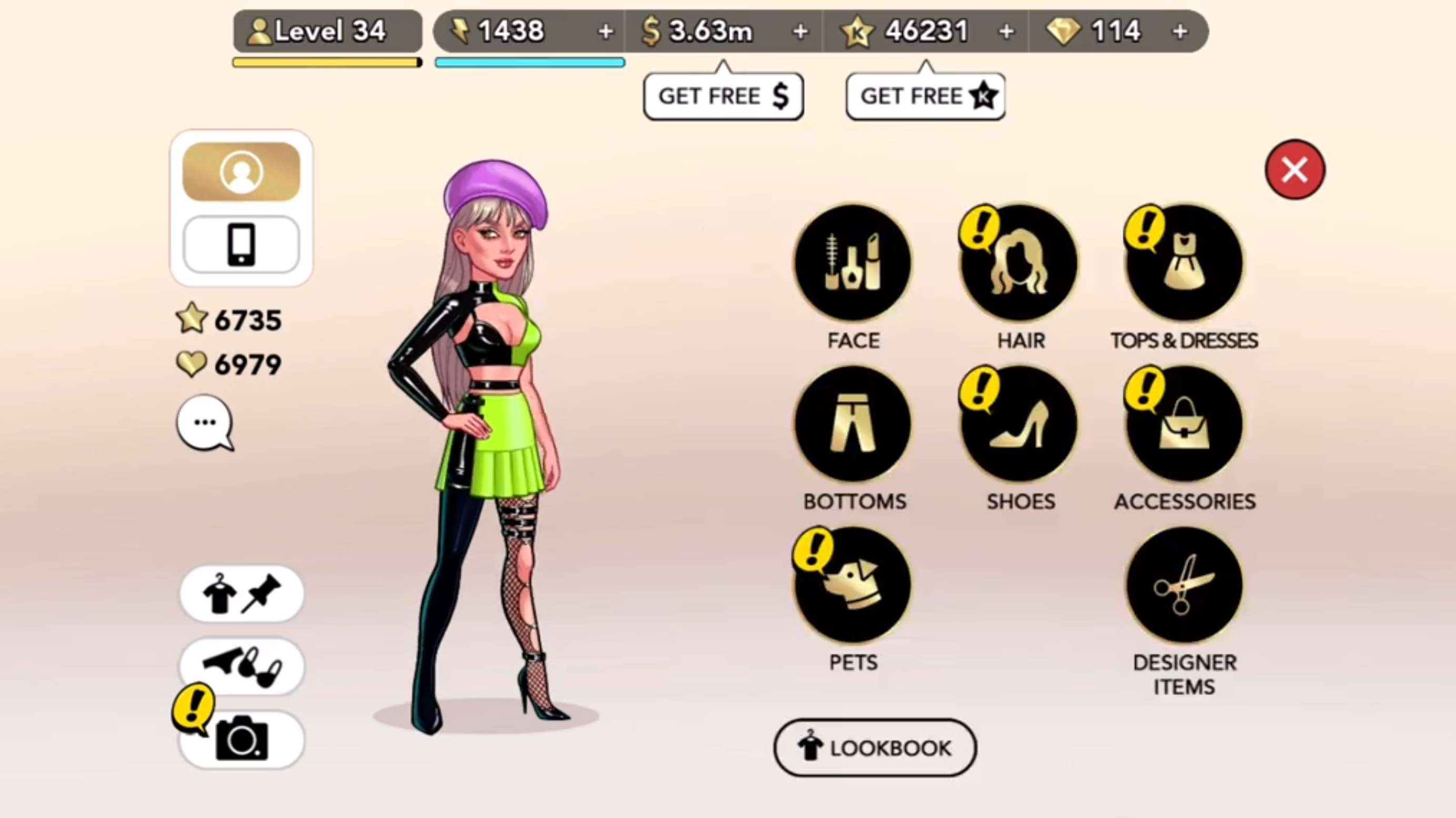
A unified icon set
All category icons were redesigned in the same gold metallic palette, bringing a cohesion to the UI that the original never had.
Named categories
Labels were added to every icon. The combination of redesigned icon + clear name makes browsing significantly faster, especially as the catalogue keeps growing.
Familiar layout, refreshed look
The three-per-row grid longtime players know was kept intact. Modernise the visuals; don't disorient the muscle memory.
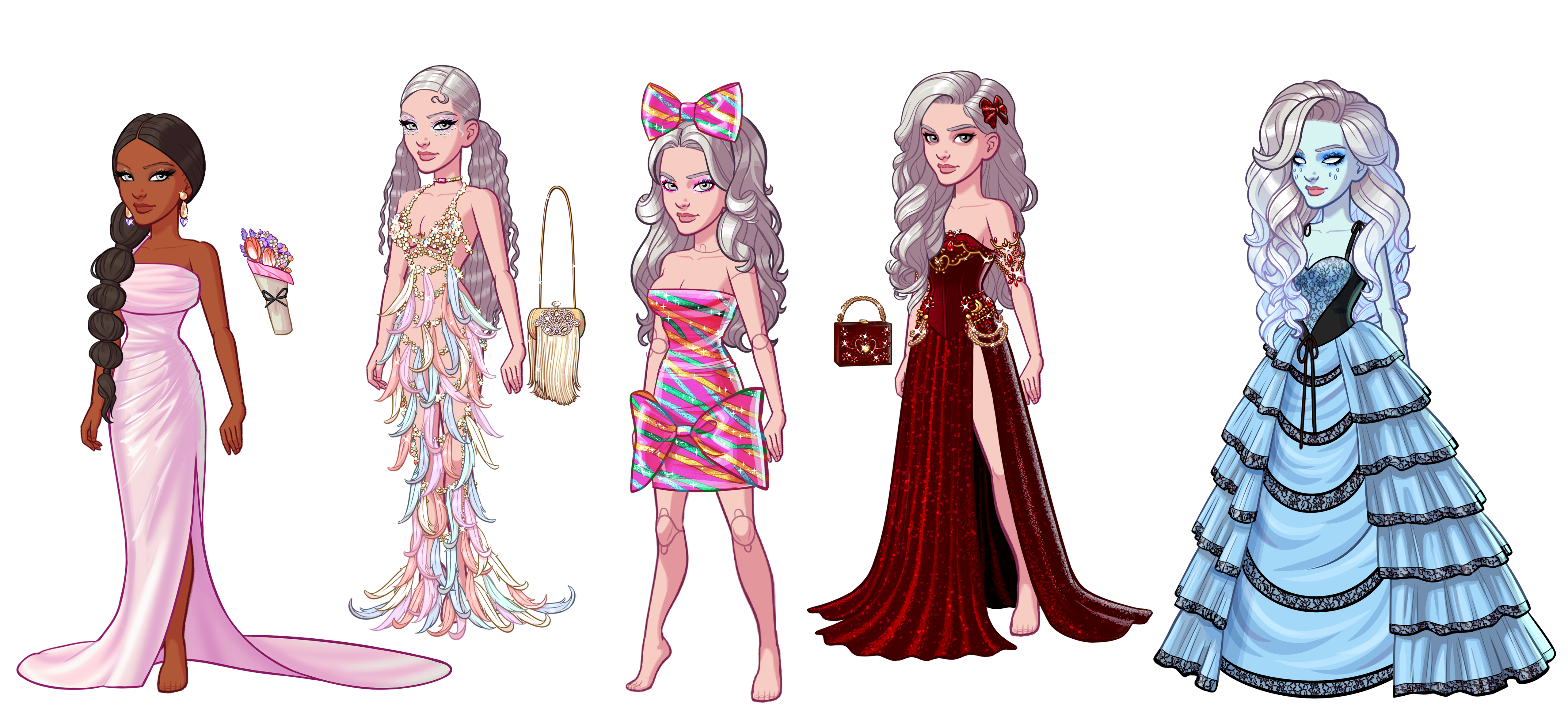
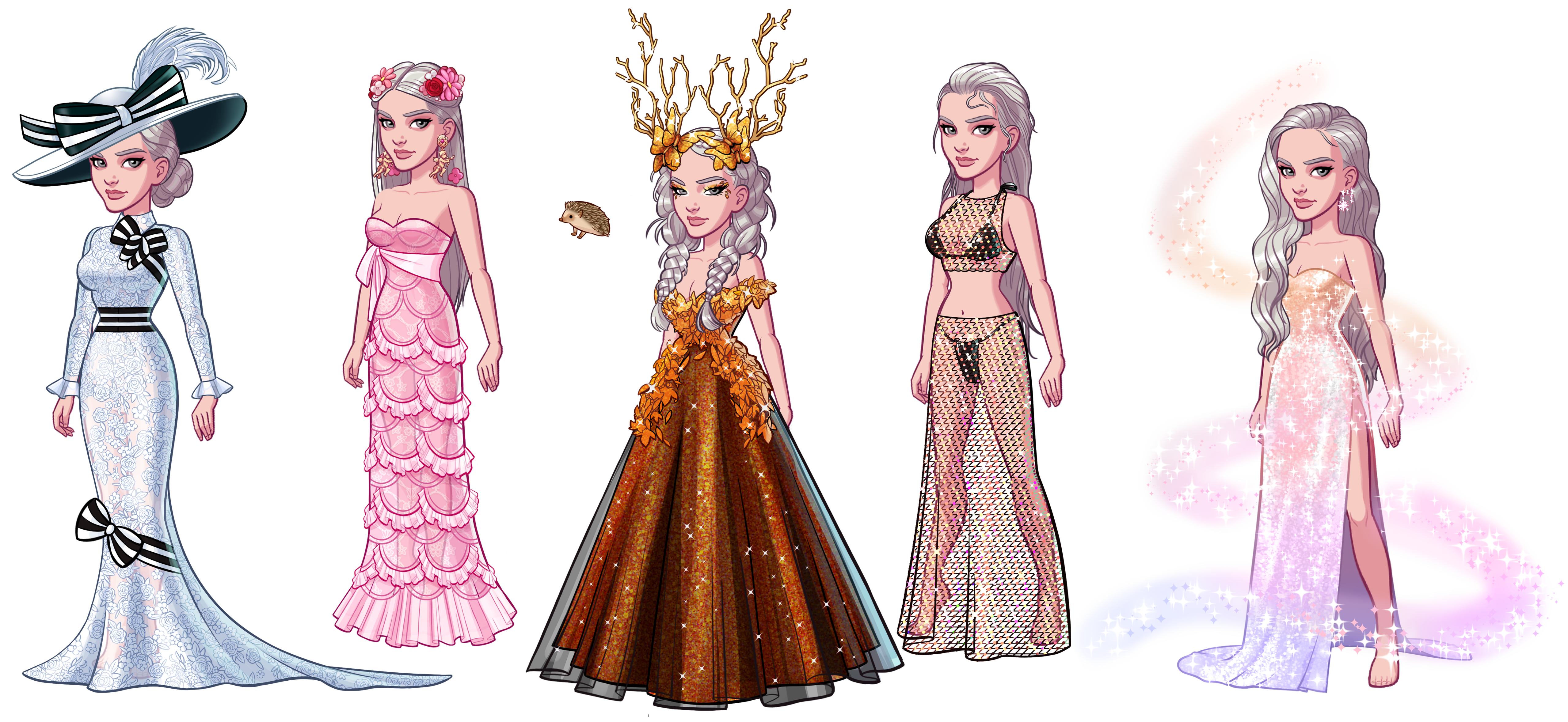
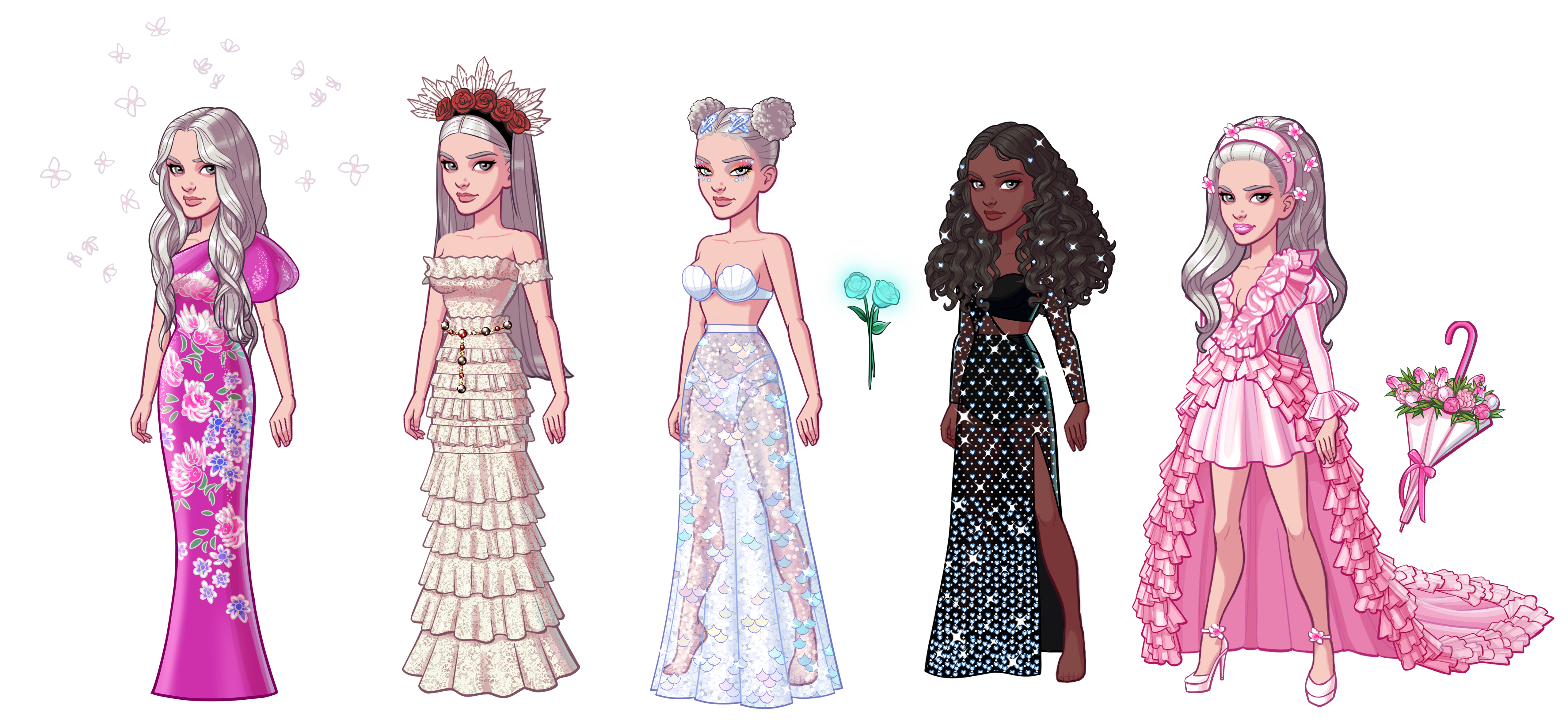
Some of my 2D work.
Alongside the UI/UX revamp, I produced 2D asset sets for the game in Photoshop and Illustrator.
What I learned.
Anchor the new in something familiar. Carrying the gold "Start" button forward gave the redesign a clear rationale and natural continuity. A single, well-loved element became the seed of an entire visual system, which made the direction easier to align on and easier to justify.
Refresh, don't relocate. Keeping the three-per-row grid was a deliberate choice to protect existing players' muscle memory. Modernizing the visual language of a live product without disrupting behavior is a harder constraint to work within than designing from scratch, and a more valuable skill to develop.
Audit before you design. The screen annotations surfaced obvious friction quickly and gave the team a shared vocabulary for the problems. It meant the redesign was solving specific, observed issues rather than working from assumptions about what might be wrong.