At a glance
The insight that shaped this project was simple: beginner bakers aren't held back by skill, they're held back by the commitment that comes before they even start. Buying a full set of ingredients for a recipe you might not enjoy is a real barrier. This project was about designing around that, building a mobile e-commerce experience that supports impulse rather than planning.
Problem
The cost and waste of buying full ingredients discourages beginners from trying baking at all.
Solution
A mobile e-commerce app for pre-portioned, one-time baking kits. Low commitment, no subscription, built for impulse.
My role
End-to-end: user research, information architecture, wireframing, visual design, and usability testing.
Outcome
High-fidelity prototype validated through 3 usability tests, with 4 design iterations addressing identified friction points.
The problem wasn't baking. It was everything before it.
Baking tends to happen around specific moments: a weekend afternoon, a get-together, a personal project. But participating as a beginner means committing to full-sized ingredients for recipes you might only make once. Pantries fill up with half-used bottles and unopened bags, and that waste becomes the reason people stop before they get started.
Existing meal kit services address a related problem in cooking, but they're built around routine. Subscriptions, weekly deliveries, ongoing commitment. That model doesn't translate to how baking actually works for most beginners. The gap I was designing for was impulse: someone who wants to bake something this weekend, not someone building a meal plan.
How might we…
… design a shopping experience with low enough friction that a beginner can go from "I want to try this" to checkout without second-guessing the commitment?
Understanding why beginners don't start.
Before defining any solutions, I wanted to understand the actual barriers from the people experiencing them. I interviewed five participants aged 20 to 35, focusing on what baking looks like in their lives, where they drop off, and what would make them more likely to try.
Key insights
- The most common barrier was ingredient waste. Participants didn't want to buy full-sized products for a recipe they might only make once.
- Long ingredient lists and unfamiliar steps made baking feel inaccessible before it even began.
- Every participant said they would bake more often if ingredients came pre-portioned and ready to use.
In their own words
Mapping what already exists.
I analyzed three companies across meal kits and baking kits to understand what features existed, what assumptions they made about users, and where the gaps were. The consistent pattern I found: every competitor required a subscription, and none of them were designed around the occasional, social nature of baking.
| Feature | Competitors | Bake Basket |
|---|---|---|
| Recipe browsing | Yes | Yes |
| Pre-portioned ingredients | Yes | Yes |
| Subscription required | Yes | Optional |
| One-time purchase | No | Yes |
| Hobby / social focus | No | Yes |
| Gift purchase | No | Yes |
Strengths
- No subscription required. One-time purchase lowers the barrier to entry significantly.
- Positioned around social and hobby moments rather than weekly meal planning.
Risks
- Without a subscription, repeat purchase behaviour depends entirely on the quality of the first experience.
- Less built-in retention compared to habit-based meal services.
Meet Heather.
After synthesizing the interview findings, I built a persona to keep design decisions grounded in a specific user. Heather captures the pattern that came up most consistently: someone who genuinely wants to bake but finds the setup cost higher than the payoff.

Heather, 28
Environmental Engineer · Toronto, ON
Works a busy 9 to 5 and unwinds with small creative hobbies. Used to bake with family, but since moving into a smaller apartment she rarely does. Limited space, missing tools, and leftover ingredients make it feel impractical. She still loves the idea for date nights or small gatherings, but the effort and commitment usually stop her before she starts.
Goals
- Quickly find a recipe that fits her taste
- Easily compare time, difficulty, and servings
- Complete checkout with minimal effort
Pain points
- Too many decisions upfront
- High cognitive load when browsing
- Effort vs. reward feels imbalanced
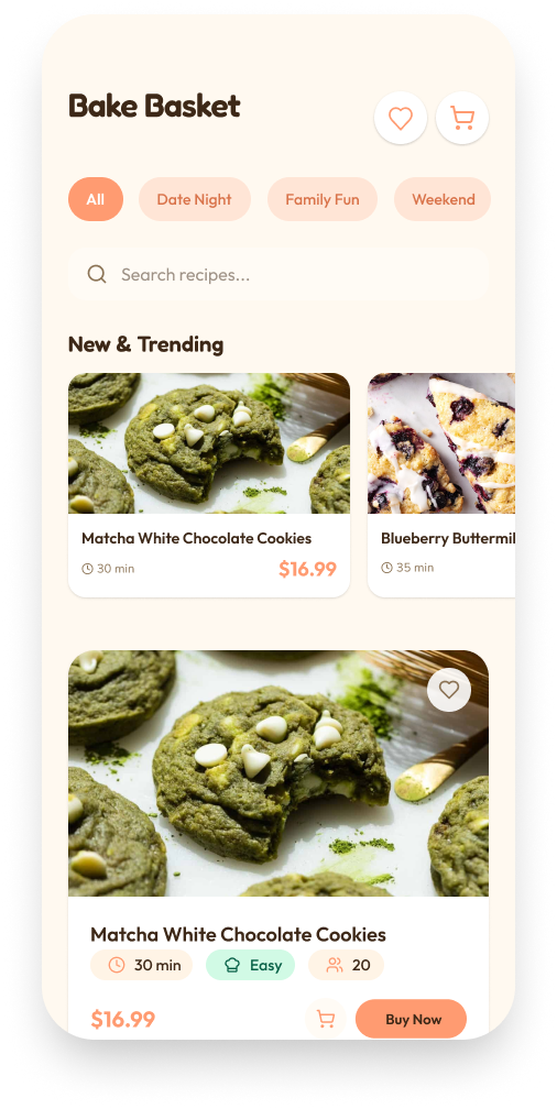
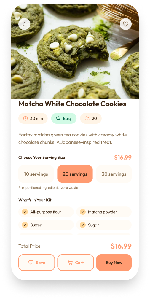
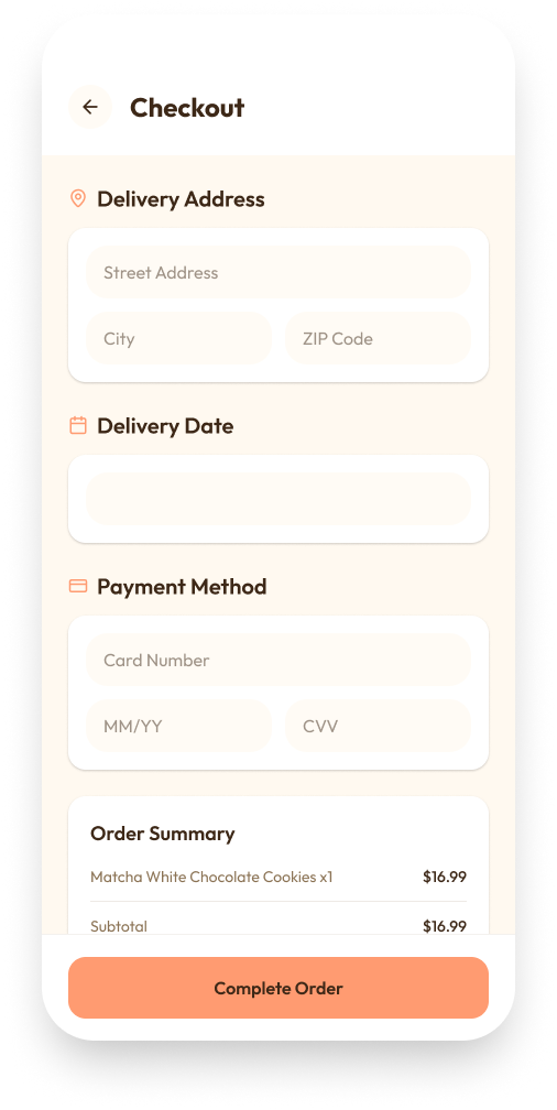
A simple, playful shopping experience.
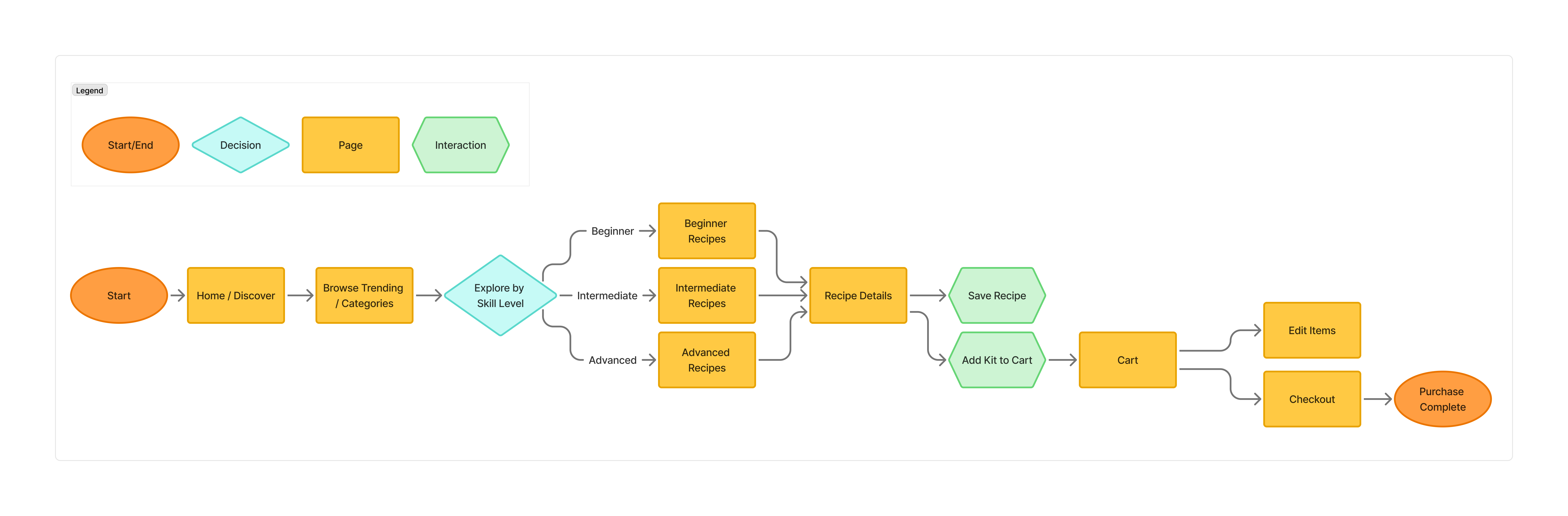
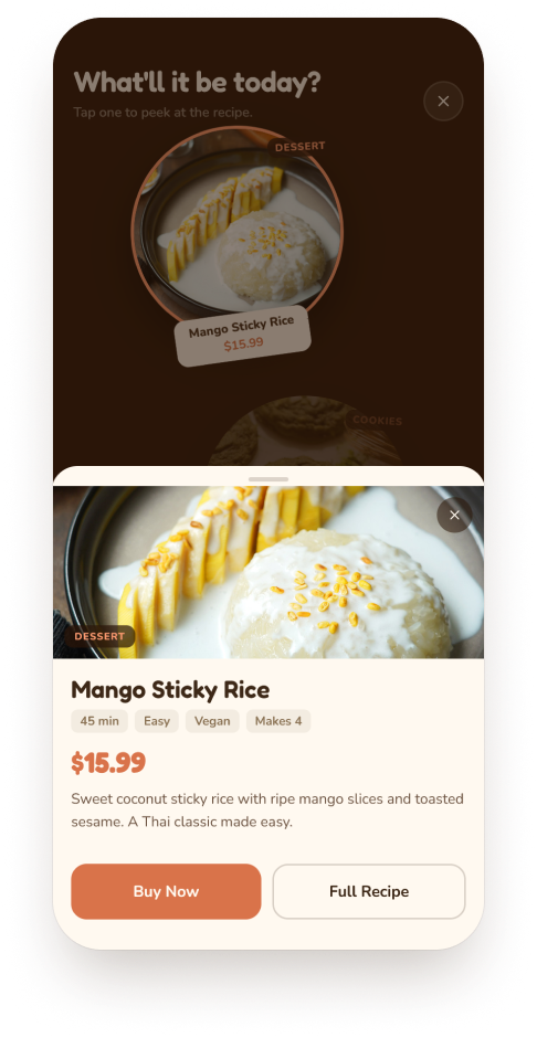
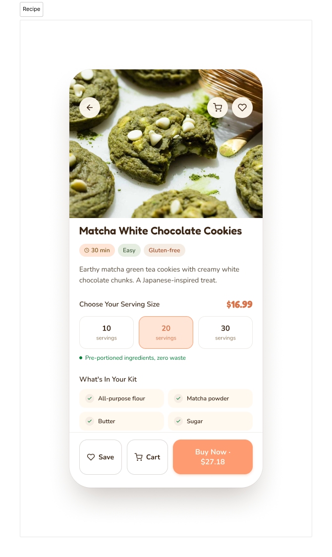
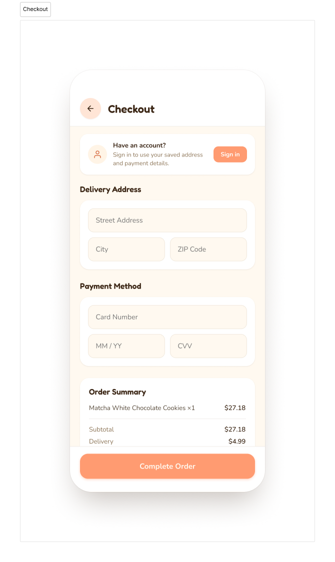
The research pointed toward a clear design goal: reduce the number of decisions a user has to make before they commit. I structured the experience around a four-step journey: discover → review → cart → checkout. Each step had one job. Browsing needed to feel inviting without being overwhelming. The product page needed to give users enough confidence to add to cart without second-guessing. Checkout needed to stay out of the way.
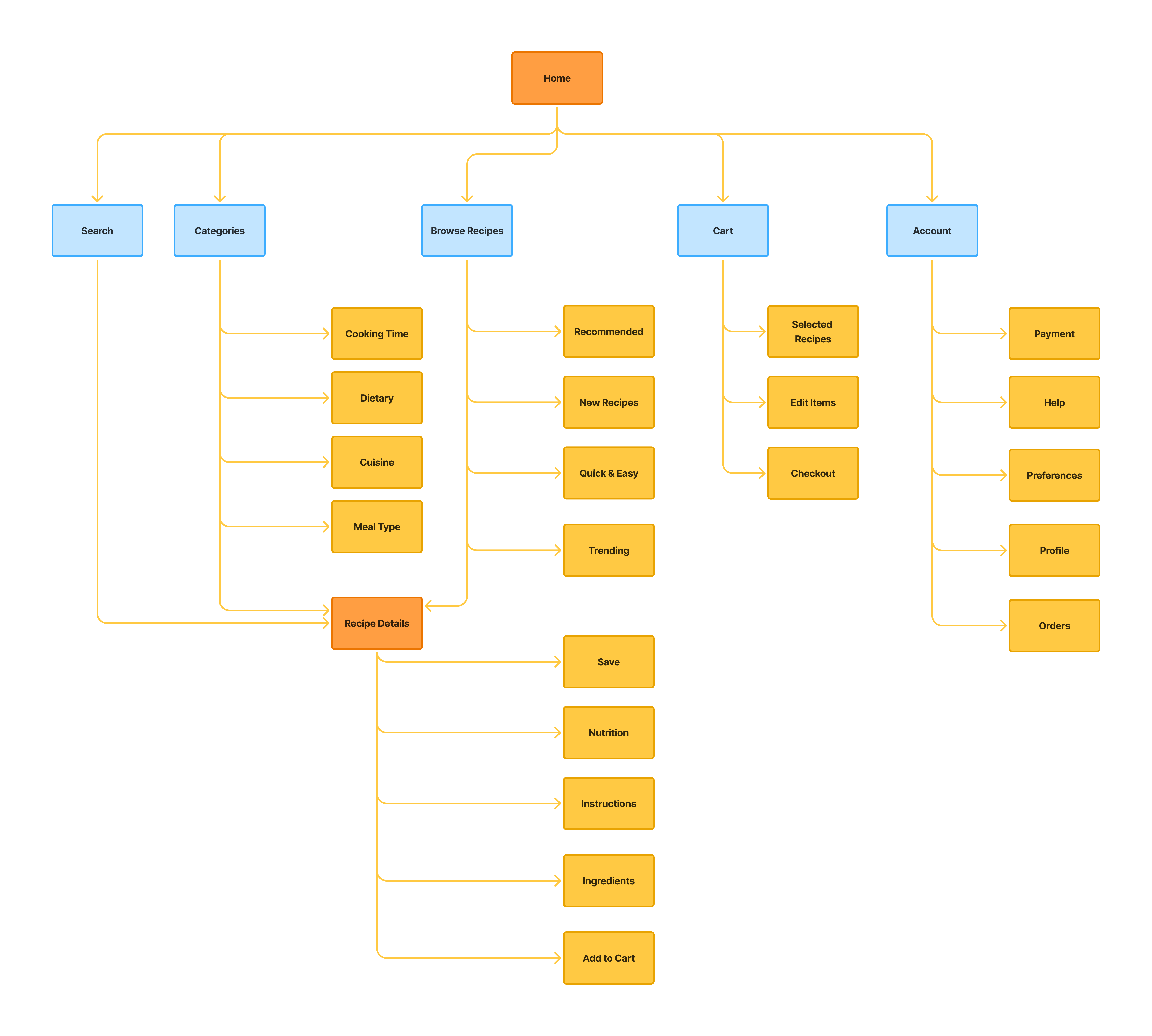
Site map & user flow.
I mapped out the app's structure and the paths a user would take through it. The sitemap kept navigation minimal: the fewer places a user has to think about going, the faster they get to the thing they actually want.
Low-fidelity wireframes.
I wireframed the core screens in Figma to validate layout decisions before committing to visual design.
.png)
.png)
.png)
.png)
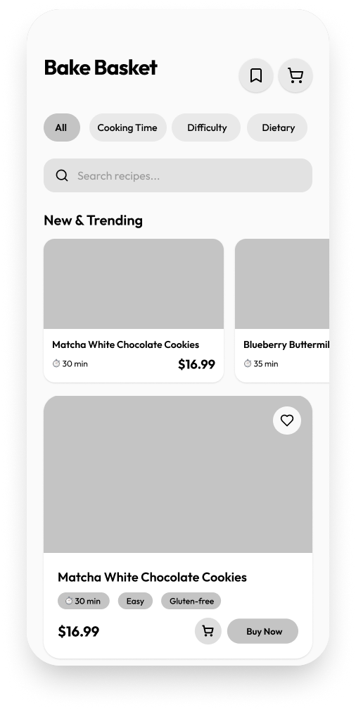
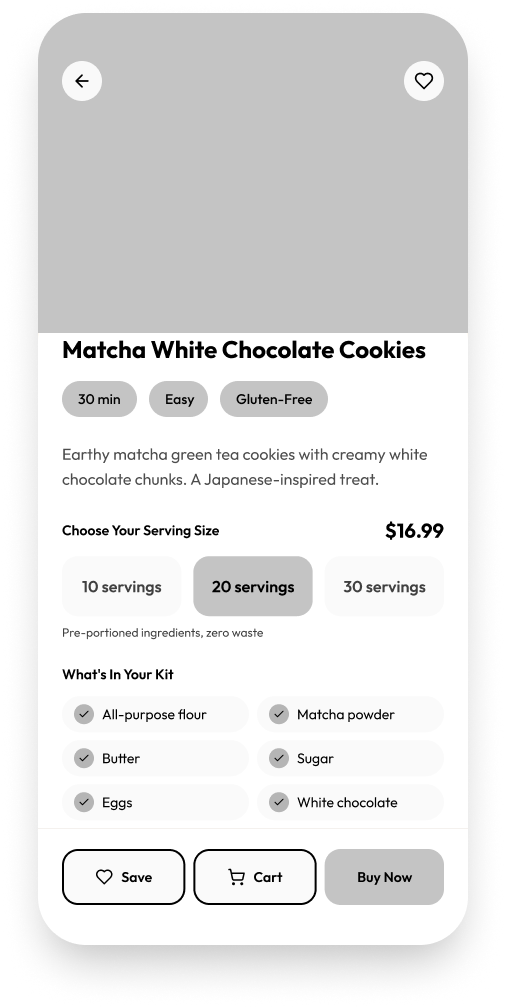
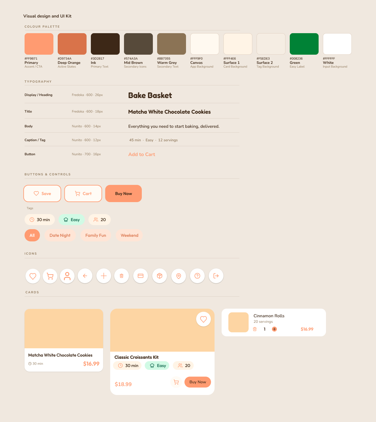
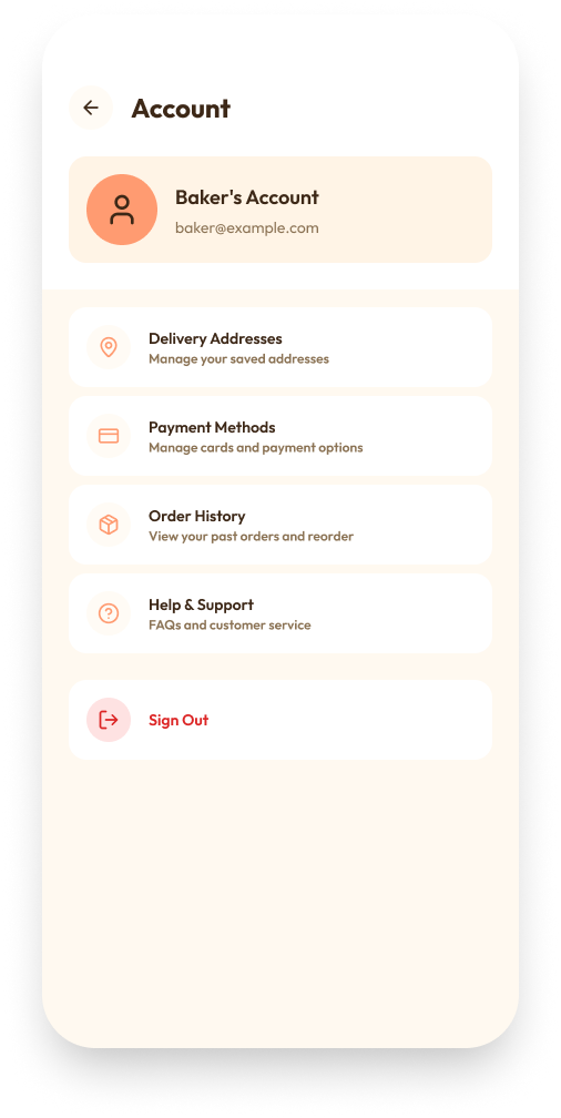
Warm, playful, approachable.
I built the system around soft pastel oranges and warm neutrals to give it a homemade, cosy feel. Rounded type, pill buttons, and softened card edges kept everything approachable. The goal was an interface that felt inviting rather than functional, one that matched the low-pressure, enjoyable experience the product was built around.
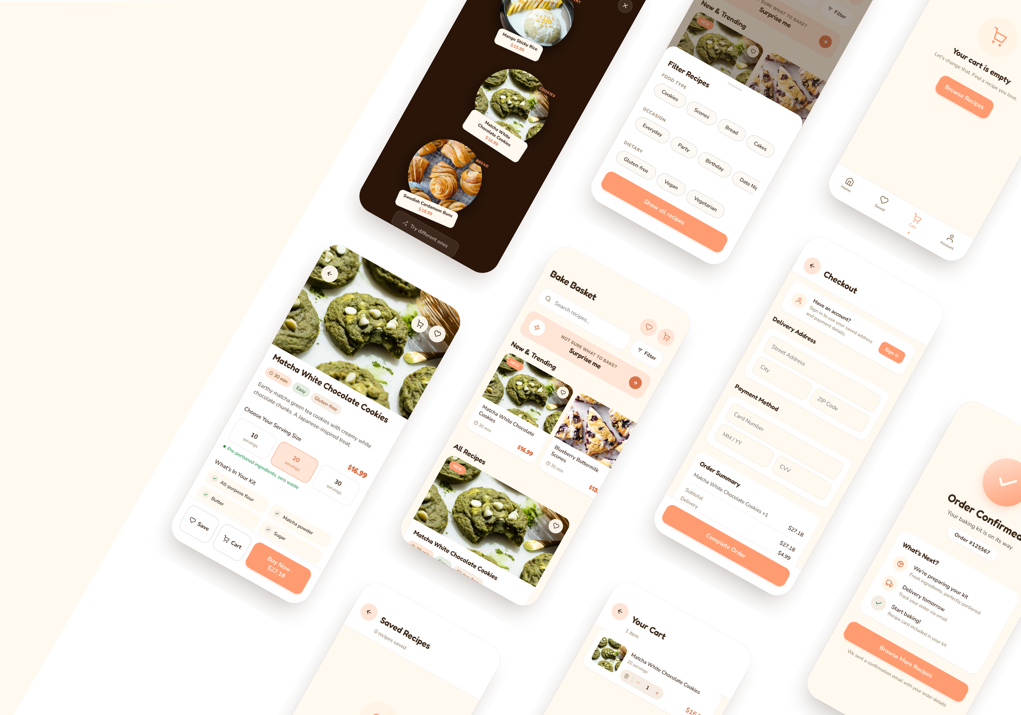
High-fidelity prototype.
.png)
.png)
.png)
.png)
Testing the prototype.
I ran a usability test with 3 participants on the high-fidelity prototype. The goal was to identify where the experience broke down, validate that the purchase flow worked end to end, and check whether navigation felt intuitive without guidance.
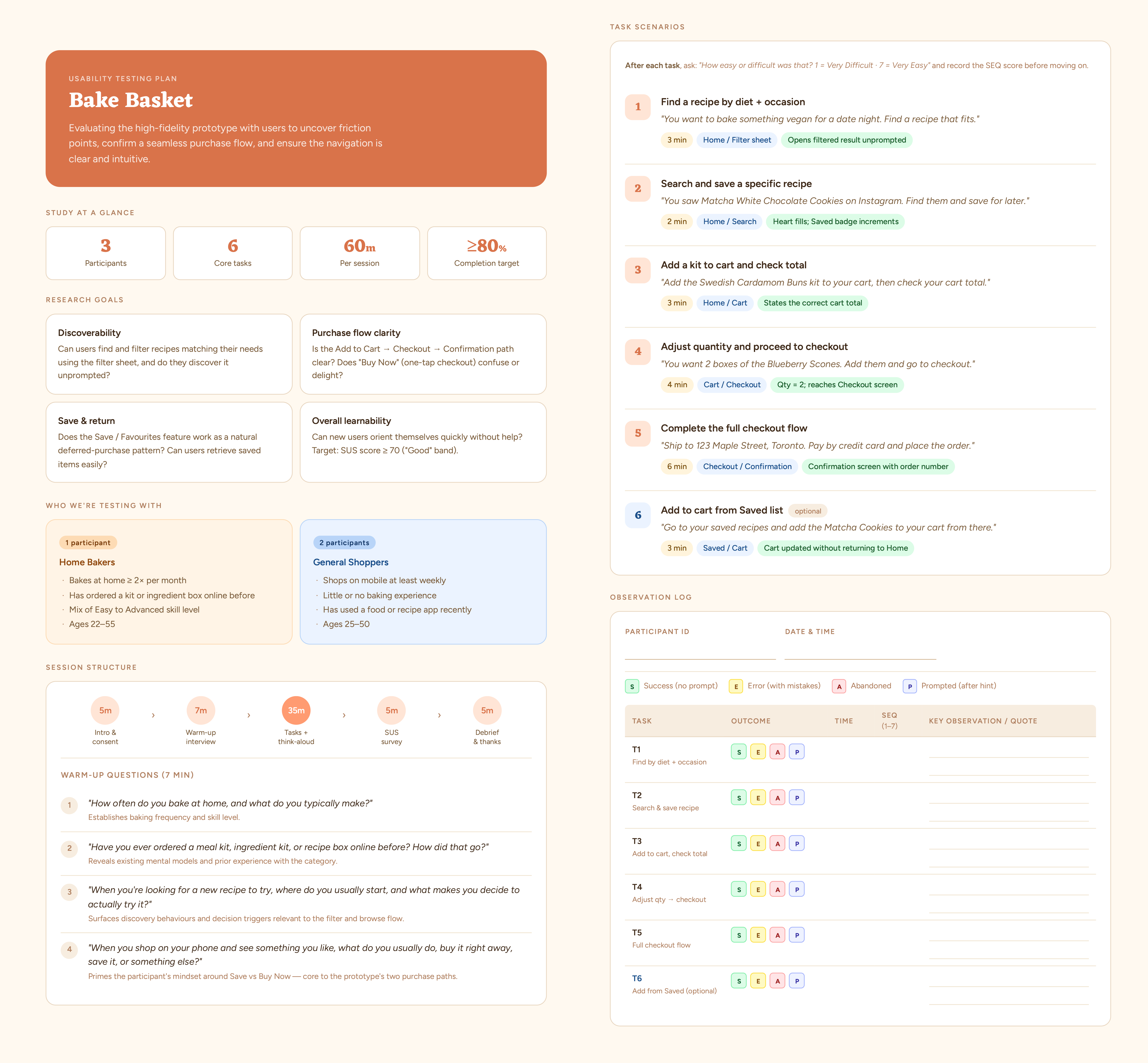
Key findings
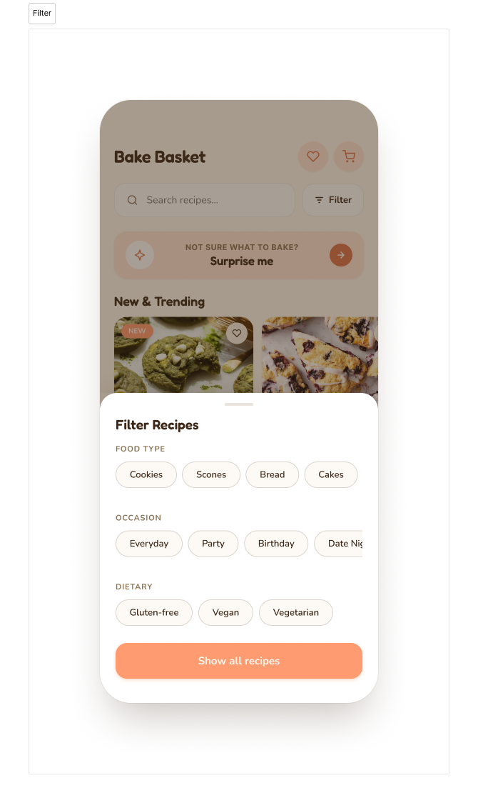
Filter navigation was confusing
Participants had difficulty narrowing recipes down. It wasn't clear which tags were active, and there was no obvious way to reset the filters once applied.
Trapped on secondary pages
From Saved or Cart, users could only navigate back to Home. This forced unnecessary backtracking when they wanted to move between sections directly.
Browsing felt overwhelming
Too many filter tags were visible at once during discovery. Users hit decision fatigue before they even reached a recipe, which was the opposite of the low-friction experience the app was designed around.
Iterating from feedback.
Each iteration traced directly back to a finding from testing. The goal wasn't to redesign for its own sake but to fix the specific places where users got stuck or slowed down.
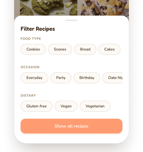
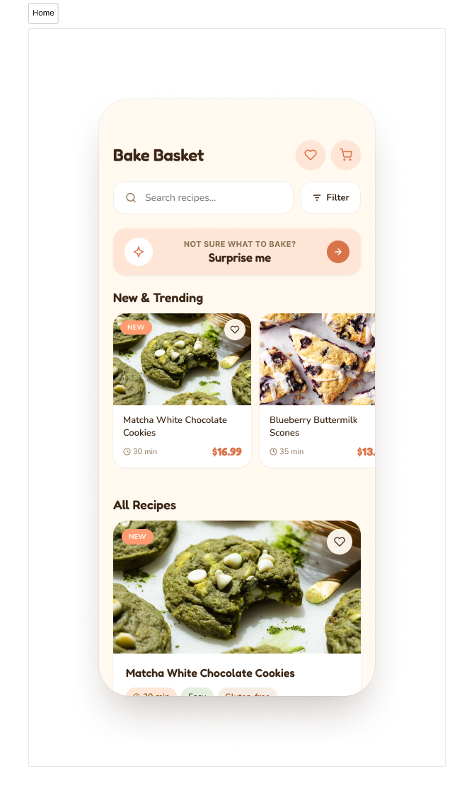
The tags on the home screen were creating noise before users even started browsing. I condensed the filter system into a single button that opens a grouped modal, which reduced cognitive load at the entry point and made the active filter state much clearer.
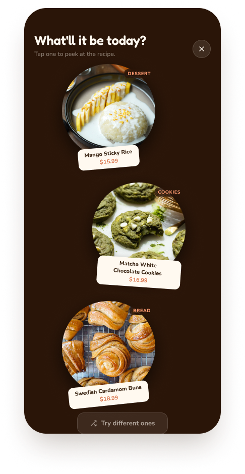
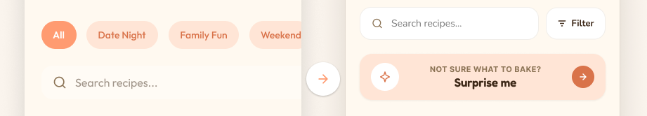
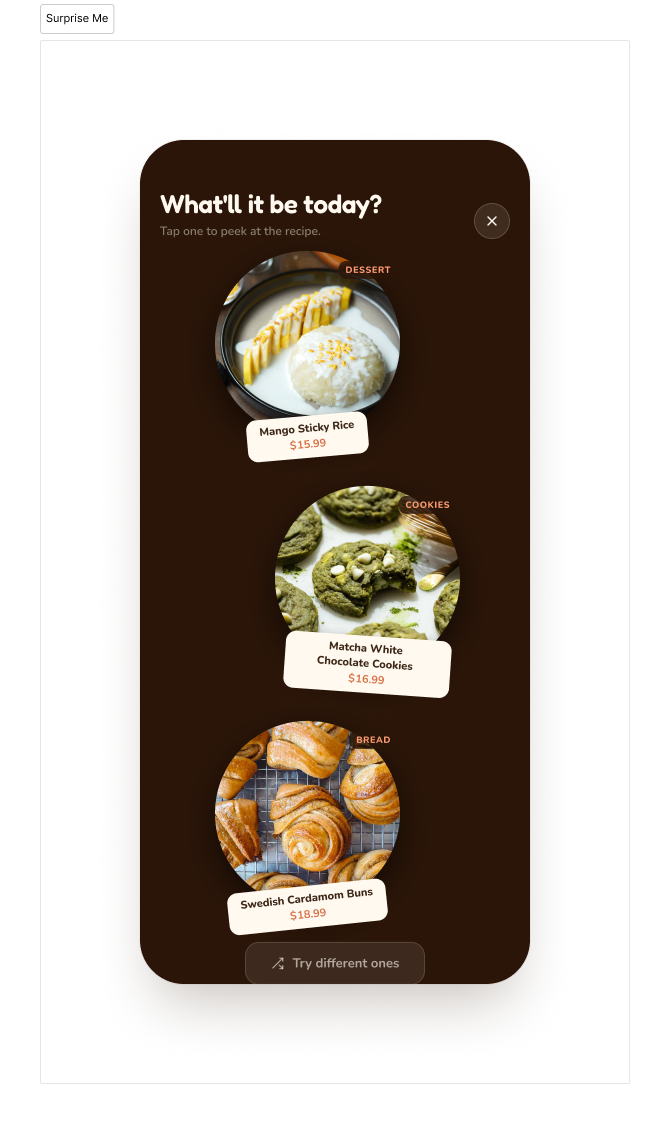
Testing showed users slowing down when faced with the full recipe list. I added a Surprise Me button that surfaces 3 randomly selected recipes, which shortens the decision path and reinforces the impulse-first nature of the product.
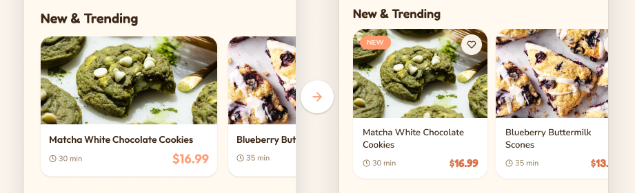
I resized the cards so the next recipe peeks into view, giving users a visual cue to keep scrolling. New and Popular tags were added to help surface relevant recipes without adding more decisions to the browsing experience.
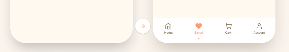
Users on secondary pages had no direct way to move between sections, which meant going back to Home every time. Adding a persistent footer navigation fixed the backtracking issue and made the overall flow feel more connected.
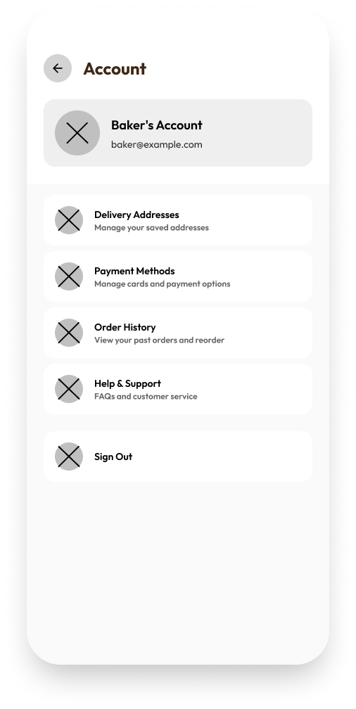
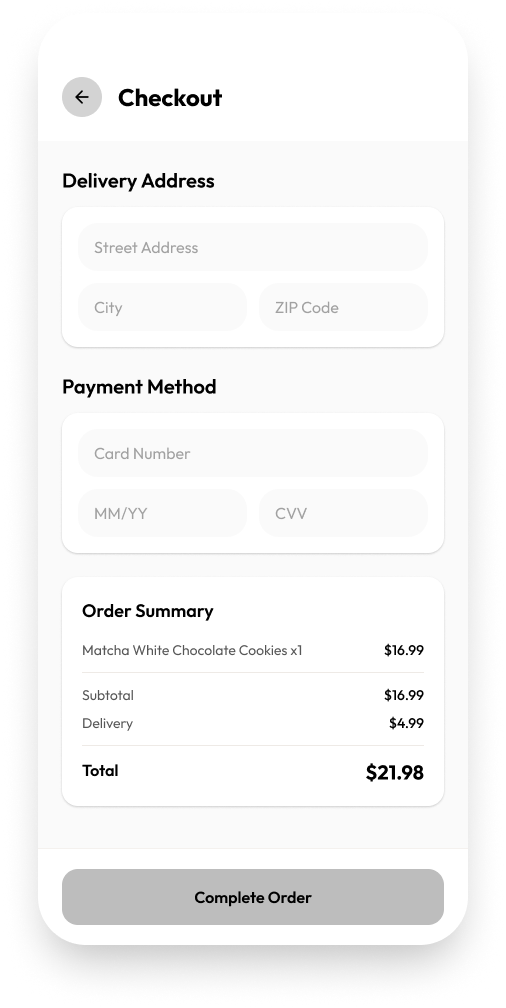
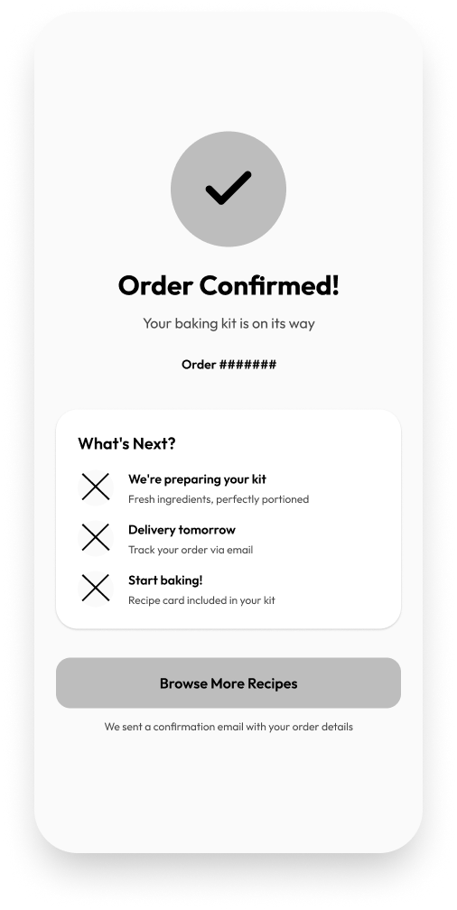
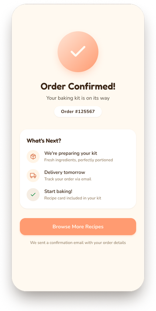
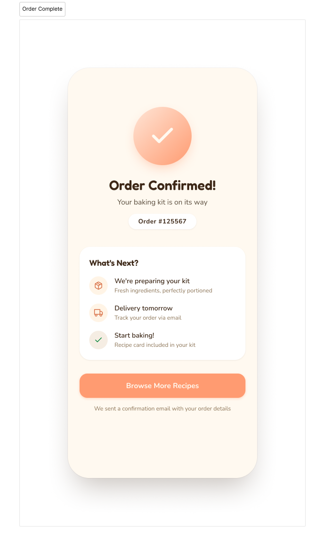
Final screens.
From browse to checkout to confirmation.
.png)
.png)
.png)
What I learned.
Less choice, more confidence. Reducing the number of options on screen made the app feel easier to use, not more limited. Collapsing the filter tags and adding a "Surprise Me" path both came from the same insight: when users feel overwhelmed before they've even started, they leave. Removing friction at the entry point was the most impactful design decision on this project.
Test the parts you assume work. I spent the most design time on checkout, assuming it would be the hardest part to get right. Testing showed the opposite: checkout was fine, but the browse and discovery experience was where users got stuck.
If I had more time. I would run a second round of usability testing on the iterated designs to validate that the changes actually solved the problems they were meant to. I would also explore an onboarding flow to set the right expectations before users hit the home screen for the first time.